Monday, 23 January 2012
Website
A website was created through www.wix.com, a site that allows you to create your own website for free. It is important that we keep costs to a minimum due to our low budget and utilise as many free sources of viral marketing as possible.
The website consists of four main sections, Home, Gallery, Reviews and Cast & Crew.
It is important that the layout of the website is not complicated so that our users can navigate easily, however, it must look professional in order to be appealing. The use of colours match that of the poster, so that the same message is being sent across through the whole marketing campaign.
Monday, 9 January 2012
Poster analysis
All these movies have one thing in common and that's that they are low budget thriller films much like ours. They also have a plot which involves crime, drugs or teenagers (of whom will be the majority of our cast).
NARC
Brick
The poster in brick has a simple word layout yet an extremely artistic visual picture in the middle which blends in some of the characters faces together. This is a similar effect I might try to achieve in my poster, due to the film having a low budget, must rely on a strong source of visual effects in advertising after production.
In this poster, the main words are highlighted are coloured in white but what's different about this poster and all the other posters apart from NARC is that it contains a quote from a review which emphasizes the strength of the film and how good it is.
Harry Brown
The juxtaposition between red and white causes a balance between the two opposing colours. Although the film has quite a sadistic atmosphere, the poster remains neutral. The tagline "Every man has a breaking point" is in white but in the red so it is clearly outlined. The violent screenshot from the film has an effect which blends into Harry Brown and fades out in the edges. The writing is bold but not too flashy which highlights the seriousness of the issues portrayed in the film.
Kidulthood
Kidulthood is another low budget British film which is possibly the most similar film we can compare ours. The poster uses a very simple layout with a quote at the top, one picture in the middle and the title and credits below. There seems to be little use of special effects but it also lets the audience know what the film is about.
I conclude that the two most interesting posters I found were Brick for its special blending effect and also Kidulthood due to its simplicity. For my poster I will try to create a mix between the two in which a screenshot will take up the whole space of the poster but has other characters blended into it.
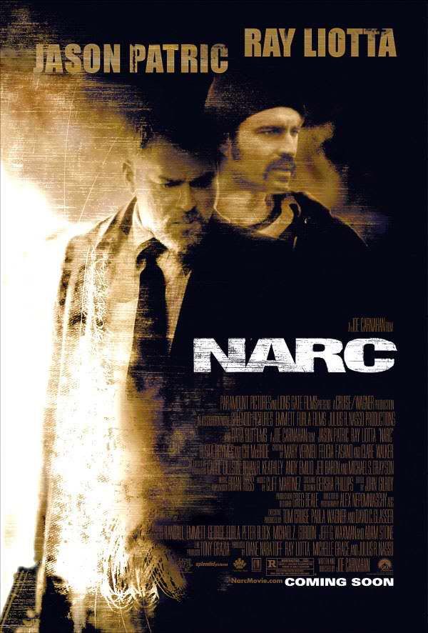
NARC
The 2002 crime thriller film NARC uses a sepia photo-effect in order to establish the mood and express the emotion within the characters faces. The layout is quite simple with just the two main characters in the middle, however the powerful visuals make it interesting and appealing to look at. The main colours in the poster are black, a sepia style brown, black and white for the title and "coming soon" writing. The fact that the title is written in an opposite colour within it's background means that it draws more attention. The "NARC" title and "comming soon" are the only white parts of the poster yet this is effective because it creates a link between the most important words in the poster.
Brick
The poster in brick has a simple word layout yet an extremely artistic visual picture in the middle which blends in some of the characters faces together. This is a similar effect I might try to achieve in my poster, due to the film having a low budget, must rely on a strong source of visual effects in advertising after production.
In this poster, the main words are highlighted are coloured in white but what's different about this poster and all the other posters apart from NARC is that it contains a quote from a review which emphasizes the strength of the film and how good it is.
Harry Brown
The juxtaposition between red and white causes a balance between the two opposing colours. Although the film has quite a sadistic atmosphere, the poster remains neutral. The tagline "Every man has a breaking point" is in white but in the red so it is clearly outlined. The violent screenshot from the film has an effect which blends into Harry Brown and fades out in the edges. The writing is bold but not too flashy which highlights the seriousness of the issues portrayed in the film.
Kidulthood
Kidulthood is another low budget British film which is possibly the most similar film we can compare ours. The poster uses a very simple layout with a quote at the top, one picture in the middle and the title and credits below. There seems to be little use of special effects but it also lets the audience know what the film is about.
I conclude that the two most interesting posters I found were Brick for its special blending effect and also Kidulthood due to its simplicity. For my poster I will try to create a mix between the two in which a screenshot will take up the whole space of the poster but has other characters blended into it.
Friday, 6 January 2012
Subscribe to:
Comments (Atom)


